Creating Chart
To create chart on reports, need to make pivot configuration at leaset one dimension or measure item need to be configured on each rows / measure.
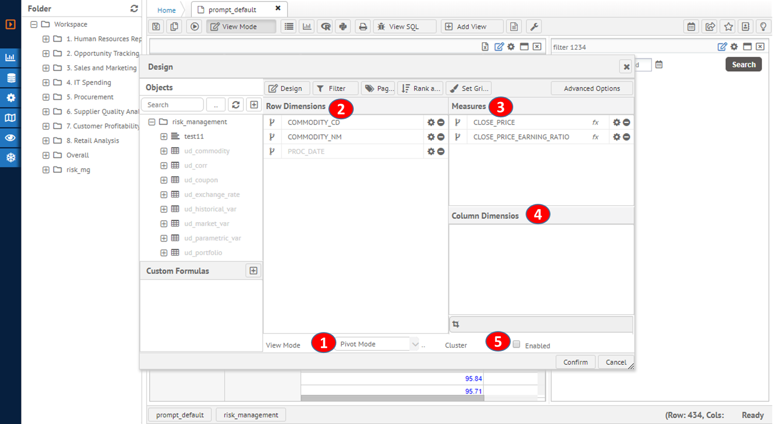
Measure section is data value on Y-axis for most of Cartesian charts including line, column and area type chart. Row section is base value for X-axis and named as category value. Column axis is optional for multiple series value on chart design. Each terms and configuration on pivot has following results as shown on the image below.
|
Chart pivot configuration |
|
|
|
|
|
|
1. Chart need to set pivot mode to distribute drawing parameter to pivot dimensions and measures 2. Row dimension section is X-axis category values 3. Measures section is Y-axis numeric values to show height of graph. Multiple measures are series parameter and each series is different color. 4. Column dimension section is series values. For multiple measures on the pivot, the combination with column dimension value and measure are the key to separate series items. |
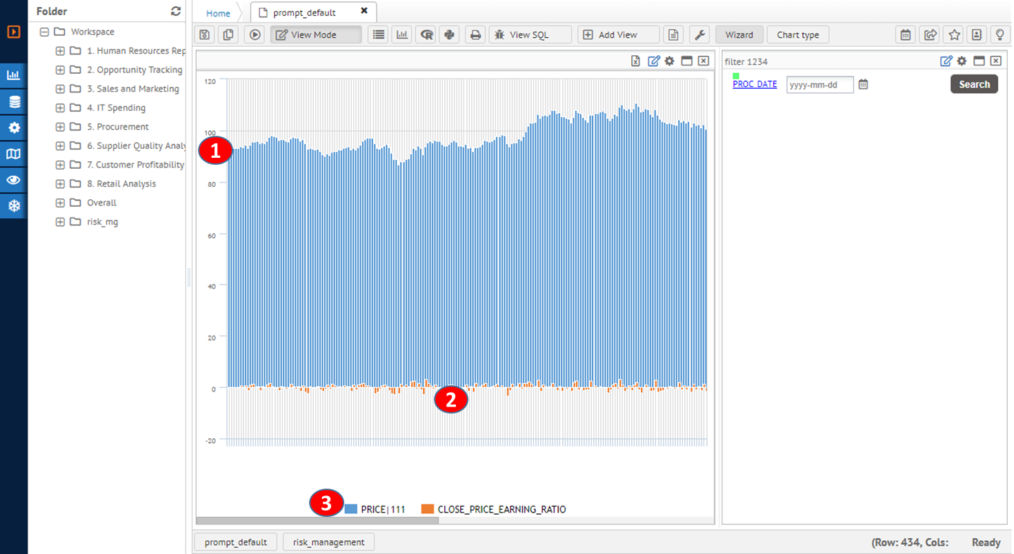
The result chart for above configuration is as follows:
|
Resulting chart example |
|
|
|
|
|
|
1. Measure value data to compare graphical level on Y-Axis 2. Category value to separate values on X-Axis 3. Legend for series item with different color combination. |